

Dining Houses: Undo-ing the Beige
Tony Rivetti
IKEA's furniture has been losing its color. The internet recently tallied more than 3,500 IKEA sofas from catalogs spanning 1960 to 2021, revealing a steady shift from vibrant reds, yellows, greens, and blues to a sea of gray, beige, and black. Now, IKEA is reversing course by reviving many of its boldest designs through its archival Nytillverkad collection.
This gravitation towards mute colors isn’t new, and it’s not exclusive to furniture. The same people who wanted toned-down homes also wanted cafés and restaurants to be the same. Restaurants have been adopting the visual language of Wabi-Sabi, favoring unfinished plaster and natural wood to restore a sense of order. Grocery shelves swapped out bright logos with cream packaging and lowercase typography. Coffee shops like % Arabica have stripped-back interiors that resemble contemporary art galleries. AnZa sells sculptural concrete espresso machines for $1,365.
But there is a limit to minimalist escapism. At some point it becomes repetitive and depressing.
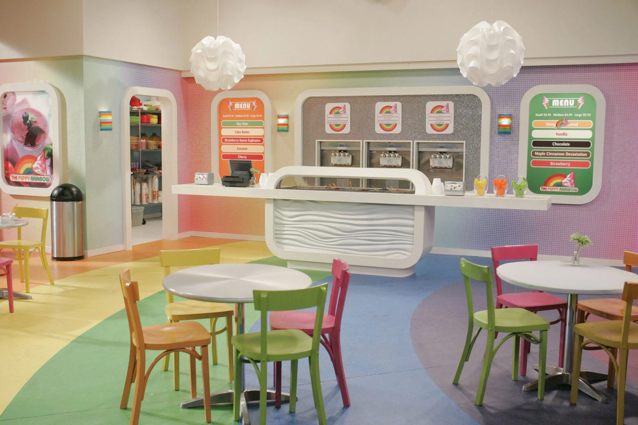
To correct this, many food places are doing what IKEA is doing: restoring colors. Strawberry matcha is layered in electric green beneath bubblegum-pink foam, a combination that has spread from indie cafés to VC-backed chains like Blank Street. Pistachio croissants are filled with brilliant green frangipane, fueled in part by the viral success of Dubai chocolate bars. Trader Joe’s seasonal ube collection returns year after year with purple mochis and ice cream.
It would be easy to explain this away as consumers searching for small moments of happiness during uncertain economic times. It’s true that modern life is standardized. Silver laptops, black phones, and white earbuds. Boucle furniture, dried eucalyptus, and linen napkins. Everywhere we look, the products have been optimized, simplified to manufacture, easier to scale, and faster to market.
But food places have been doing this “color correction” for another reason: making craftsmanship visible. Japanese nerikiri wagashi, for example, have long been hand-sculpted into seasonal flowers, maple leaves, and chrysanthemums using naturally tinted bean paste. Today, chefs increasingly borrow from that philosophy. Cédric Grolet’s hyperrealistic desserts are airbrushed and hand-painted to resemble lemons, hazelnuts, figs, and apples so convincingly that diners often mistake them for real fruit. Dominique Ansel has increasingly blended French pastry with Asian bread and dessert traditions through concepts like Papa d'Amour, where taro lace mochi doughnuts, guava-strawberry pastries, and croissant shokupan showcase laminated dough, layered fillings, and cross-sections designed to reveal the work hidden inside.
This is why people want more kakigōri, mille-feuille, dragon beard candy now. People want to see the hours of glazing, molding, and assembly, which are hard to discern when everything is monochromatic. Consumers are buying reassurance that someone sourced these ingredients, prepared them thoughtfully, and left traces of that labor visible on the plate. In a marketplace filled with automation, color is the new proxy for culinary skills.
On the other hand, handcrafted colorful food makes for very marketable material. Historically, vibrant colors symbolized wealth. The geometric glamour of Art Deco embraced gold, emerald, sapphire, and lacquered finishes. Mid-century American diners were obsessed with cherry reds and turquoise blues, and Memphis Design played a lot with new shapes. The glossy optimism of the Frutiger Aero era, from Windows XP wallpapers to MSN icons, imagined technology as colorful and organic.
Then Apple Stores and Muji happened. Aesop carved boutiques out of concrete too. People began to find activated charcoal fashionable not because black food tasted better but because it aligned with contemporary ideas of elegance. Having good taste means having restraint and self-control. Color became associated with mass-market products and not refinement.
The minimalism was very beloved, but it created an unexpected problem: brands still needed something visually distinctive. As logos flattened and retail grew increasingly monochromatic, the burden of spectacle shifted onto the product itself. Restaurants could no longer rely solely on cuisine, service, or décor to stand out in an endless social media feed.
How does a food post stand out when sandwiched between Alo haul reels and Box Water ads? Erewhon’s smoothies must glow in dragon fruit pink and spirulina blue. Bingsu must be crowned with jewel-toned fruit and Japanese cream sodas layered with melon-green. Hibiscus lemonades ought to bloom crimson, and saffron must migrate from paella into specialty pastries. Also, don’t forget to throw in some ruby chocolate, pandan cakes, calamansi tarts, and beet hummus on the menu once in a while. The list does not end.
We were taught growing up to not play with our food at the dinner table. But it seems like now restaurants encourage exactly that. Stir the strawberry foam into the matcha. Squeeze lemon juice into butterfly pea tea and watch it change color. Record it before you taste it!
Is this bad? Colorful food likely remains one of the few socially acceptable ways adults can embrace visual play without permanently altering social expectations and their carefully curated lives. Restaurants are responding to a generation that wants proof that something is real, but they are also responding to platforms that reward spectacle and shareability. We outgrew colors at some point but now we are asking for it back.
Marie Kondo encouraged people to own fewer things, but the broader culture may have erroneously equated that philosophy with good taste. Clean countertops can help with productivity and sparse design can communicate financial success, but the opposite isn’t true. To decorate and use colors is not the same as appearing unserious. Colors bring joy and that is a fact.
Across fashion, chrome accessories, colorful sneakers, chunky jewelry, nail art, and unmistakable Y2K references have returned. Adult coloring books have enjoyed a surprising resurgence. The irony is difficult to ignore, because childhood was the last time many of us inhabited spaces designed to delight the senses. Maybe McDonald’s Playplaces should come back. So should Lisa Frank folders, Crayola crayons, arcade carpets, and carnival rides. It would be easy to call this nostalgia, but maybe what people are really searching for through food is permission to decorate, to experiment, and to embrace delight without being called childish, which is sad.
